Projects that function as a perfect communication system
Each project is a universe unto itself. Each graphic element is created with the aim of generating the perfect atmosphere to help the brand connect with its target audience.

Design for The Lost to the River
Design for the group experience brand The Lost to the River.
A fresh and fun brand that promotes exploration and personal discovery through group adventures visiting different countries.


Henrry Schein CONDOR DENTAL RESEARCH
A dental supply brand located in Switzerland with whom we have been developing marketing visuals and sales catalogs for over 6 years.

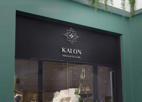
Visual identity design for Kalon Beauty Center
Kalon is a beauty brand with a powerful message: beauty resides within each individual, stemming from inner balance that then manifests in one's physical appearance. Therefore, we opted for a geometric design, based on a succulent that expands from a wellness center, symbolizing radiance and beauty.


Visual Identity Design for
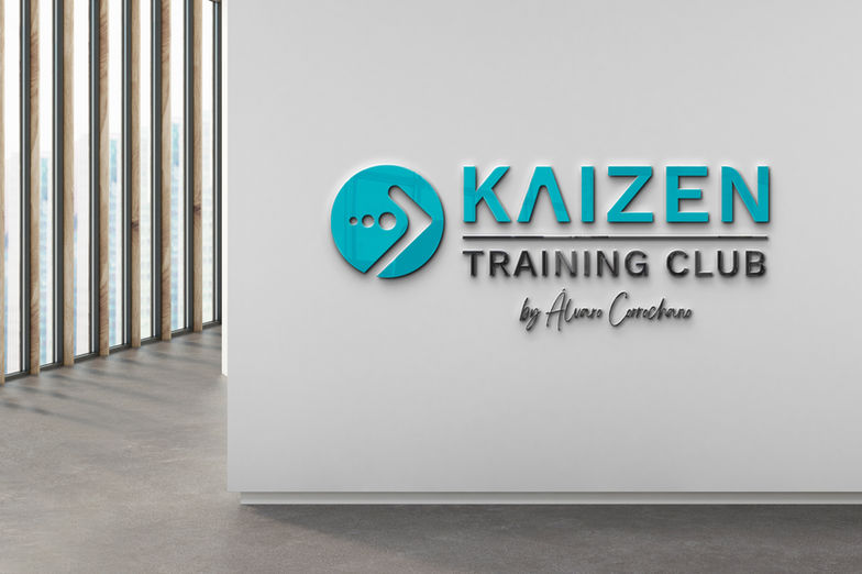
Kaizen Training Club
The Kaizen Training Club brand focuses on the famous Kaizen method, based on the idea that continuous improvements, however small, are what lead to a visible result if they are maintained over time.
The design is minimalist and uses the concept of the circles growing until they advance in the shape of an arrow.
The entire graphic is based on moving circles, and the color enhances professionalism without being aggressive, since their ideal client is someone who doesn't have much training experience and they want them to feel comfortable.

Shall we talk about your next project?
If you liked what you saw, imagine it could now be done for your brand. We can discuss your project and find out which service might be right for you. If we're a good fit and you're interested in my proposal, we can work on your visual identity.
BOOK A FREE 20-MINUTE CALL OR MEETING HERE


